The Challenge
FrameFlow had built a powerful project management tool, but user feedback consistently pointed to a steep learning curve and cluttered interface. Key features were buried, onboarding was confusing, and power users were frustrated by inefficient workflows.
The Solution
We redesigned the entire dashboard experience with a modular, progressive disclosure approach. The new interface surfaces the most-used actions first, collapses complexity into expandable panels, and introduces a consistent component system that makes the product feel intuitive from the first click.
Our Approach
How we got there
- 1
Analyzed 200+ user feedback tickets to identify pain points
- 2
Created user flow diagrams for 8 core workflows
- 3
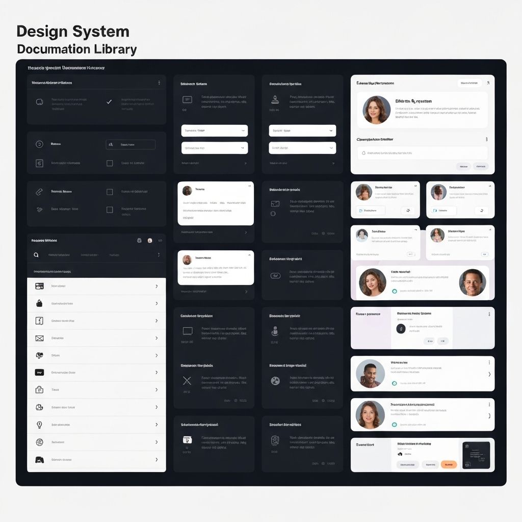
Designed a component library with 60+ reusable elements
- 4
Conducted 3 rounds of usability testing with real users
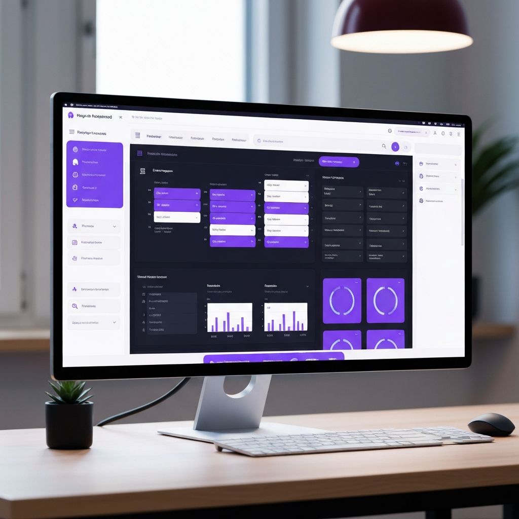
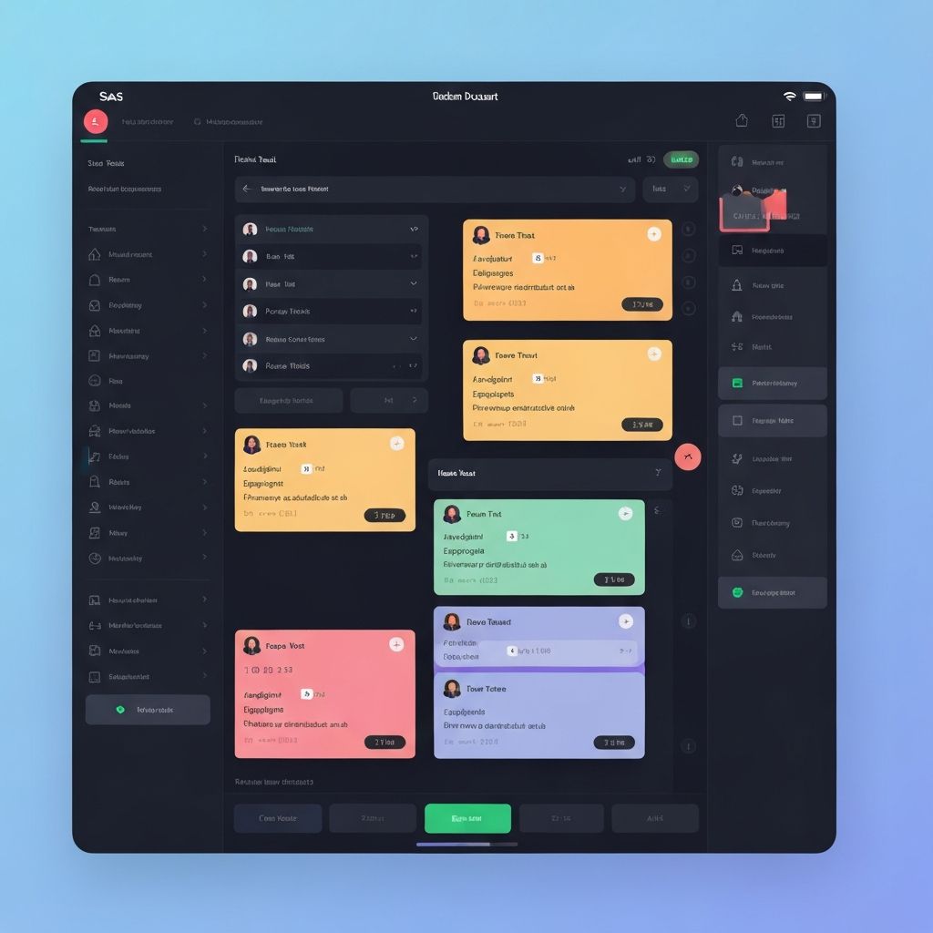
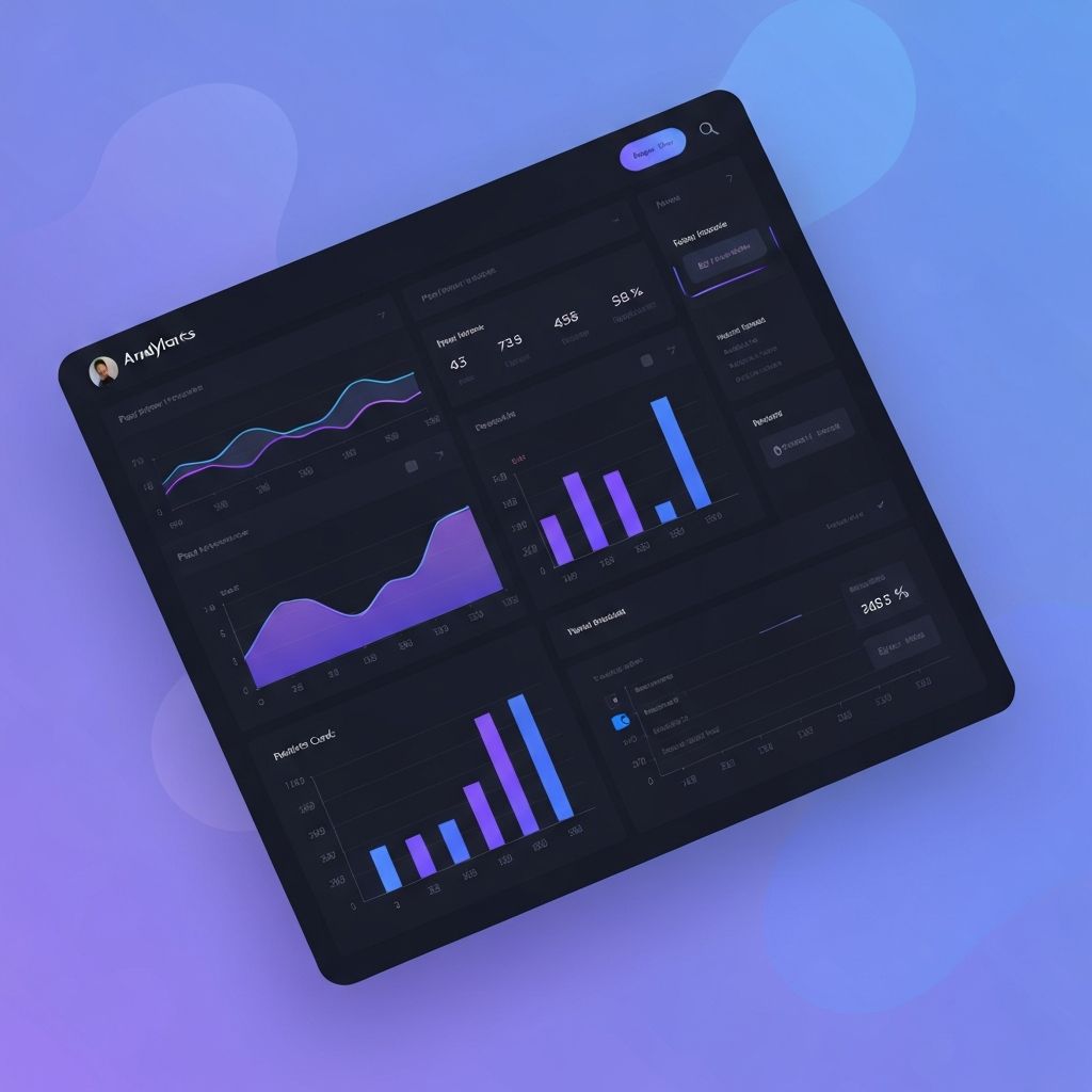
Project Gallery
Results
The impact
“The redesign was a game-changer. Our users went from frustrated to delighted, and the metrics prove it.”
Ready to give your brand a sharper digital presence?
Let's discuss how we can transform your ideas into polished digital experiences that connect with your audience and drive results.